
TL;DR
Key insight: The most valuable category is not necessarily the one that generates the most revenue.
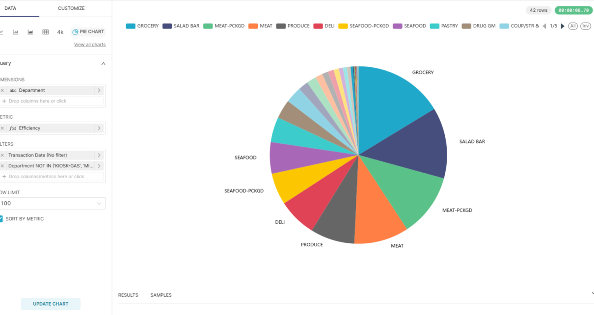
When viewed through a traditional revenue chart, Groceries appears to be the clear winner in the Complete Journey dataset. However, this result is hardly surprising—Groceries also occupies a large portion of the product assortment. Knowing that a large category generates large revenue does not necessarily lead to actionable business decisions.
The more interesting question is:
Which categories generate the most revenue relative to their size?
To answer this, I created a custom metric called Efficiency:
Efficiency = Revenue Contribution (%) ÷ Category Size (%)
This metric measures how effectively a category converts its share of the assortment into revenue.
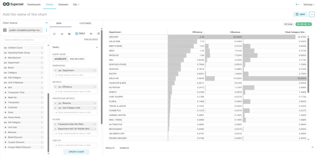
The result reveals a much more interesting story. While Groceries ranks #1 with an efficiency score of 2.05, it requires 27% of the total category size to achieve that performance. Salad, on the other hand, ranks #2 with an efficiency score of 1.80 while representing only 0.23% of the category size.
In other words, Salad generates a disproportionately large amount of revenue relative to the number of products it contains. This is the kind of insight that is nearly invisible when looking at absolute revenue alone.
This demonstrates the value of analytics solutions when paired with metrics designed to answer a business hypothesis. If our hypothesis is simply “Which category generates the most revenue?”, the answer is obvious and often not worth the effort of building dashboards. But when the hypothesis becomes “Which category overperforms relative to its size?”, analytics can reveal non-obvious patterns that support better merchandising, assortment planning, and investment decisions.
How we arrived at this conclusion: Rather than ranking departments by total revenue, we used Apache Superset to calculate and rank categories using the custom Efficiency metric. This shifted the analysis from a descriptive view of sales to an evaluative view of performance, allowing us to identify categories that deliver exceptional results relative to their footprint. This is where analytics moves beyond reporting and begins to generate genuine business insight.
Dataset
Use this SQL query:
select
dd.date as "Transaction Date", dd.year as "Year", dd.month as "Month", dd.day as "Day of Month", dd.day_of_week as "Day of Week", dd.quarter as "Quarter", dd.half_year as "Half Year",
dt.hour as "Transaction Hour", dt.half_hour as "Transaction Half Hour",
d.classification_1 as "Age Group", d.classification_2 as "Income Tier", d.classification_3  as "Household Size", d.classification_4  as "Children Count", d.classification_5 as "Spending Power Group",
p."MANUFACTURER" as "Manufacturer", p."DEPARTMENT" as "Department", p."BRAND" as "Brand", p."COMMODITY_DESC" as "Category", p."SUB_COMMODITY_DESC" as "Sub Category", p."CURR_SIZE_OF_PRODUCT" as "Unit of Measure",
t."DAY", t."TRANS_TIME" as "Transaction Time", t."WEEK_NO" as "Week No",
t."BASKET_ID" as "Transaction", t.household_key as "Customer", t."STORE_ID" as "Store",
d."HOMEOWNER_DESC" as "Home Owner", d."KID_CATEGORY_DESC" as "Kid Category",
t."QUANTITY" as "Unit Sold", t."SALES_VALUE" as "Revenue",
t."RETAIL_DISC" as "Retail Discount", t."COUPON_DISC" as "Coupon Discount", t."COUPON_MATCH_DISC" as "Coupon Match Discount"
from transaction_data t
left join product p on p."PRODUCT_ID" = t."PRODUCT_ID"
left join hh_demographic d on d.household_key = t.household_key
left join dim_date dd on dd.date_id = t."DAY"
left join dim_time dt on dt.time_id = t.time_idSave and use as dataset (aka Save dataset)! It will open chart design using saved dataset.
Data exploration: Identify which SKU are outperforming.
To begin exploring product performance, drag Revenue into the Metrics section and set the aggregation to SUM. Then drag Department into Dimensions.
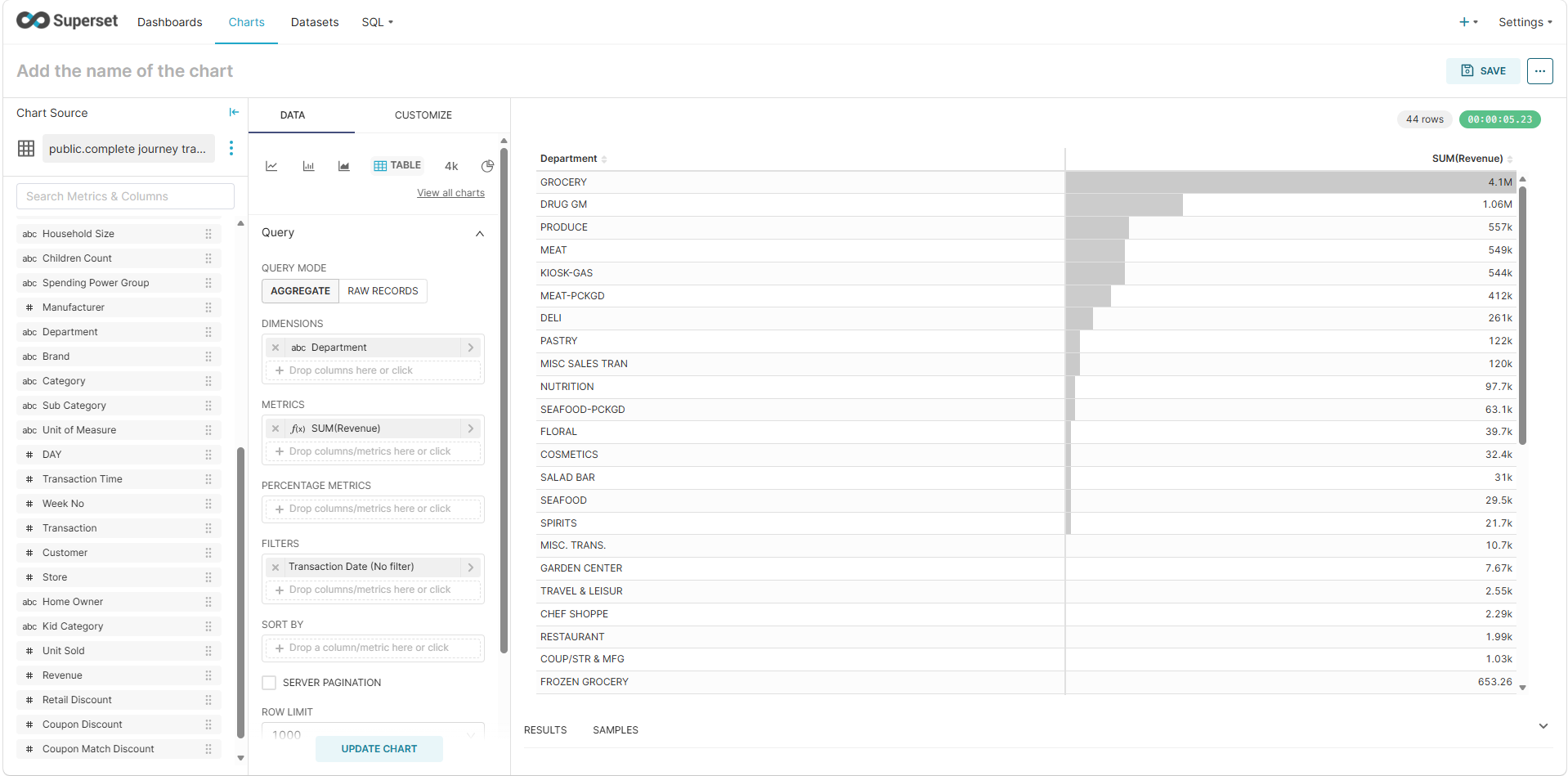
The chart immediately shows that Groceries is the top-performing department in terms of revenue. While this is unsurprising, absolute revenue alone does not tell the whole story.
Next, drag Sub Category into Metrics and set the aggregation to COUNT DISTINCT, then refresh the chart.
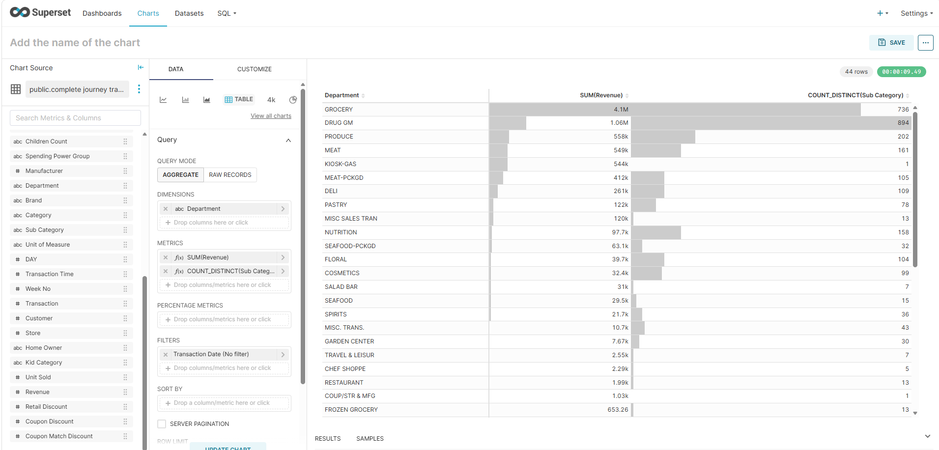
This reveals an important insight: although Groceries generates the highest revenue, it also has the second-largest SKU footprint (measured by the number of distinct sub-categories). In other words, part of its success may simply come from having a larger assortment. This demonstrates why relying solely on absolute metrics can be misleading.
Adding Relative Metrics
To gain more context, add both Revenue and Sub Category as Percentage Metrics. Then rename the metrics to make their purposes clearer:
Metrics
SUM(Revenue)→ RevenueCOUNT_DISTINCT(Sub Category)→ Sub Category Size
Percentage Metrics
SUM(Revenue)→ Revenue ContributionCOUNT_DISTINCT(Sub Category)→ Sub Category Size Contribution
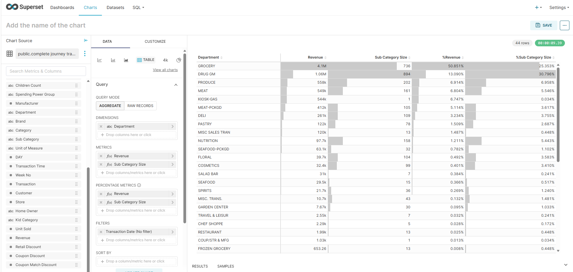
With these relative measures, we can see that Groceries maintains its leading position not only in absolute revenue but also in overall revenue contribution. At the same time, its sub-category size contribution remains proportionally large, confirming that its strong performance is supported by a broad product assortment.
Introducing a New Metric: Efficiency
To identify departments that generate disproportionately high revenue relative to their assortment size, we can create an Efficiency metric.
Efficiency normalizes revenue by comparing a department’s share of total revenue against its share of total sub-category size. This helps highlight departments that outperform expectations while maintaining a relatively small SKU footprint.
Remove Sub Category Size from the Metrics section. Then rename the Revenue metric to Efficiency and replace it with the following custom SQL:
(
    SUM("Revenue") / SUM(SUM("Revenue")) OVER()
)
/
(
    COUNT(DISTINCT "Sub Category")
    / SUM(COUNT(DISTINCT "Sub Category")) OVER()
)An efficiency score greater than 1 indicates a department is generating more revenue than its relative share of assortment would suggest.
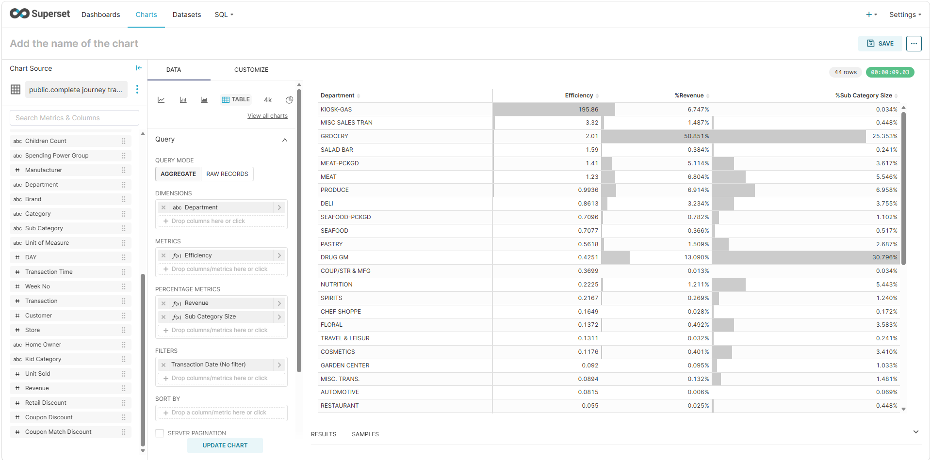
Removing Outliers
The new chart reveals that KIOSK-GAS has an exceptionally high efficiency score compared to all other departments. Its performance is so extreme that it distorts the overall analysis.
To remove it:
- Drag Department into Filters.
- Select NOT IN.
- Enter:
KIOSK-GAS
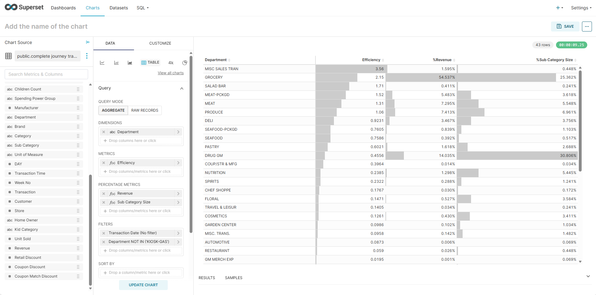
After excluding KIOSK-GAS, another outlier emerges: MISC SALES TRAN. Apply the same filtering method to remove this department as well.
With these outliers removed, the analysis becomes much more meaningful.
However, we found another outlier: MISC SALES TRAN. Remove it with same approach above.
Key Findings
The cleaned dataset reveals several interesting patterns:
- Groceries remains the strongest performer. Although it has the second-largest sub-category size, its revenue generation remains proportionally strong, suggesting consistent demand across a broad assortment.
- Salad ranks as the second most efficient department despite having a relatively small sub-category footprint. This indicates a highly productive assortment and may warrant further investigation.
- Packed Meat and Meat both perform well individually. If considered together, they represent a particularly strong category cluster and may offer opportunities for cross-selling or category optimization.
- Drug has a notably large sub-category footprint relative to its efficiency. This may indicate category sprawl and suggests that management should review how products are categorized and whether the assortment can be streamlined.
What Should Managers Do Next?
This analysis helps identify where performance is strongest, but it is only the beginning. Potential next steps include:
- Conducting price sensitivity analysis to improve margins.
- Designing bundling strategies around high-performing categories.
- Launching targeted promotional campaigns for efficient departments.
- Optimizing assortment size by removing underperforming sub-categories.
- Reviewing category structures, especially in departments such as Drug, where SKU complexity appears high relative to returns.
By moving beyond absolute revenue and focusing on efficiency, managers can better understand which departments truly outperform and where operational improvements can deliver the greatest impact.